National Logo and Usage
![]()
When it came time to redesign the Surfrider logo, we were presented with an opportunity to pay homage to the original logo from 1984. Our new design is a modernized interpretation of our initial logo that brings a progressive and visionary attitude to the familiar and beloved original. Sharp lines represent the power and strength of the ocean. And thanks to its bold fonts and a contained lockup, this logo appeals to the next generation of Surfrider supporters while honoring our roots.
Our new design is a modernized interpretation of our initial logo that brings a progressive and visionary attitude to the familiar and beloved original. Sharp lines represent the power and strength of the ocean. And thanks to its bold fonts and a contained lockup, this logo appeals to the next generation of Surfrider supporters while honoring our roots.
LOGO VARIATIONS
![]()
It is a diverse and ever changing media landscape out there. We have created a few formats of our logo to accommodate the wide range of applications and set of guidelines to help you choose the best option.
The primary logos (horizontal/vertical) should be used as the first option for any application provided that it meets the other logo guidelines listed in this document.
The waves symbol is the most minimal version of our logo to be used in brand promotion. The symbol should only be used in cases where both the primary and horizontal logo cannot be displayed within the guidelines. Additionally, the symbol should only be used when another form of brand identity is present.
MINIMUM WIDTH AND CLEAR SPACE
![]()
The size of a logo can range drastically depending on the application. The logo size corresponds directly with visual hierarchy of the document being created and while we have no maximum requirements for overall width, we do have set minimum logo widths. Logos should remain at or above the listed minimum to preserve impact and clarity. Follow these guidelines to ensure correct scaling. Always remember to scale proportionally and never distort the original files.
It is important to keep our logos clear of any other graphic elements. To regulate this, a clear space has been established around each logo variation. This clear space indicates the closest that any other graphic element or message can be positioned in relation to each logo or symbol. The clear spaces have a fixed relationship that should never be changed in any way. Maintaining clear space promotes good spatial relationships with other objects in a composition and helps to ensure visibility and impact.
LOGO MISUSE
DONT ADD EFFECTS
Drop shadows, bevels, gradients and strokes don’t mix with the Surfrider logo.
DONT MODIFY THE LOGO
The Surfrider logo should never be redrawn, distorted, rotated or added to.
DONT CHANGE THE COLOR
The Surfrider logo must remain the specified blue, black or white. Don’t fill it with other colors, patterns or photos.
![]()
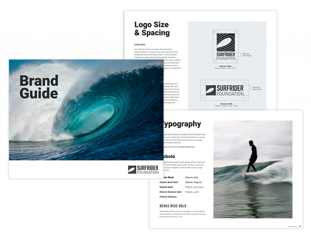
BRAND GUIDE
Before downloading or using any of the logos, please familiarize yourself with the Brand Guide, available here. Please follow all of the branding guidelines and reach out to us with any questions. We appreciate your help in maintaining a consistent brand identity for the Surfrider Foundation.